As we move into the time of year when we all crave a cosy, comforting home to retreat to, it’s important that our colour schemes reflect that warmth, while also expressing our personal style. There’s something deeply satisfying about letting your personality shine through your home design and paint choices, creating a space that feels like a true escape where you can fully unwind and indulge in relaxation.
We spoke with Ruth Mottershead, Creative Director of the family-run business – Little Greene - , to talk all things colour, focusing on fun, comfort, and personal expression in colour design. Whether you're looking to gently experiment or dive headfirst into bold palettes, Ruth shares practical advice on how to bring colour into your home. From tips on colour blocking and coordinating shades to exploring which colours we’ll see more of in 2026, this is your guide to embracing creativity in your space.
What’s your approach to using colour in the home - do you start with a mood, a palette, or a particular item you love?
“Choosing colour should be an enjoyable, creative process, and you shouldn’t feel restricted. The key is deciding what sort of style or atmosphere you want to create. The colours you choose to surround yourself with will often determine how the space makes you feel. Also take into consideration the colours that already exist within the space. Furniture, textiles, flooring and artwork are all elements that should be included as colours within your palette.
When beginning your project, take the time to research schemes that you would like to recreate - browse magazines for inspiration or images on Pinterest and Instagram. Also request colour cards – this will really help to inspire your project. If you are a hands-on decorator, mood boards are a great way to edit and add to ideas.”

Are there any colours you find yourself returning to time and again? Why do you think they work so well?
“As the colour of nature, green is a colour that we will always feel comfortable with in the home. Our homes are places where we want to surround ourselves with comforting, soothing colours that are not only easy to live with but also deliver a joyful and uplifting feel, and greens are a wonderful choice to achieve this balance of tranquillity and optimism. Earthy, muted tones such as ‘Boringdon Green' and 'Ambleside' are perfect for creating calm in the bedroom, whilst the brightness of ‘Garden’ creates energy and vibrancy in a lively kitchen.
For a neutral scheme, colours with earthy undertones can also help us connect with our natural environment. Natural stone colours such as ‘Portland Stone,’ ‘Clay’ and ‘Bath Stone’ are perfect for creating restful living spaces that bring comfort to the home.”
How can someone who’s colour-shy begin to introduce more into their home without feeling overwhelmed?
“Using shades from the same colour family is a good way to introduce colour in a subtle way. Our ‘Colour Scales’ collection offers our most popular colours within families of graduated tones, made using the same pigments, but in different strengths. This palette provides a timeless choice if you are looking for soft, neutral tones to create natural movement throughout the home.

A great way to introduce deeper shades into a neutral scheme is by colour blocking. Each ‘Colour Scales’ family includes four lighter hues, and two stronger shades that can be incorporated as colour accents – for example on the lower walls, woodwork, or on a piece of cabinetry. The darker hues will add an interesting contrast to your scheme, and they can also help to bring out the undertones in the paler shades.”
Do you think certain colours have a stronger connection to feelings of comfort or cosiness? If so, which ones and why?
“Earthy shades, particularly browns have historically been used for their practicality, and are often dismissed as being dated or dull. However, rich, warm colours based on umber and ochre have an inherent warmth to them and help us connect more with our natural environment to deliver cocooning, restful and charming spaces.
A soft powder-pink like ‘Masquerade’ is the perfect colour for bringing warmth to a space, whilst making us feel uplifted and calm. Also consider the shades in our ‘Sweet Treats’ palette. Deeper, richer caramels like ‘Affogato’ and ‘Muscovado’ create enticing and sumptuous spaces, whilst soft golds like ‘Madeleine’ and ‘Bombolone’ provide comfort, and reflect the desire to create warmth within our homes.
Don’t be afraid to embrace a darker brown, like ‘Ganache’ or ‘Chocolate Colour’. These rich, chocolate browns are perfect for creating restful living spaces that bring comfort to the home and envelop a space. They work wonderfully as an alternative to a neutral, or where you might previously have considered black, charcoal or a dark blue, bringing a calm and warm atmosphere to an interior.”

What colours are inspiring you as we head into 2026? Are there any unexpected shades or combinations you’re excited to explore?
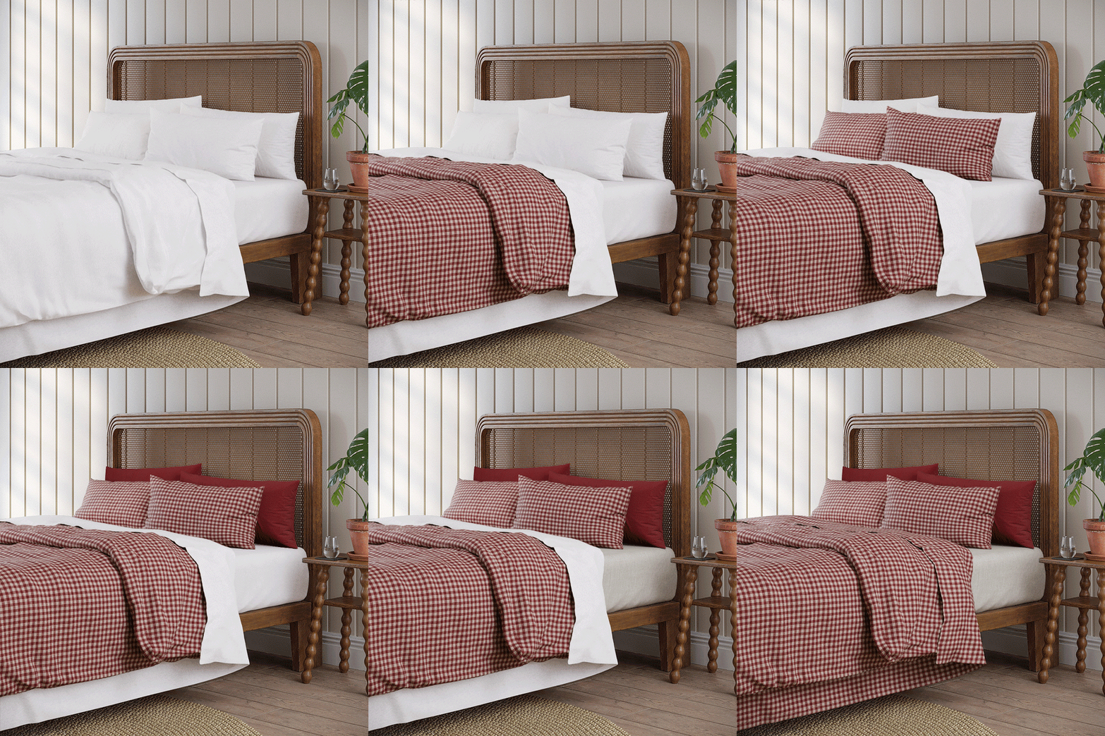
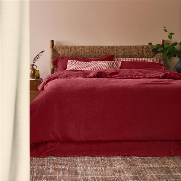
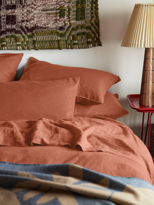
“We are definitely seeing a transition to burgundy and red. Muted yet bold reds such as Arras, Adventurer, Córdoba and Purple Brown are a step ahead of chocolate brown tones. Burgundy looks especially wonderful on cabinetry and woodwork.”
